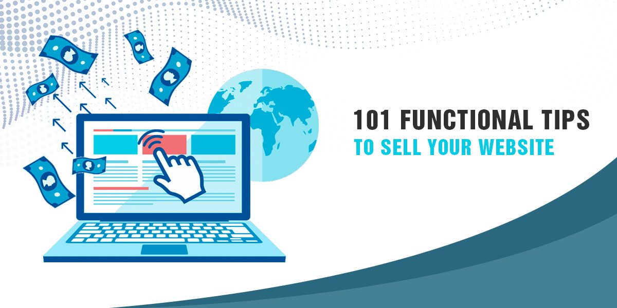
A website is the finest way of making your digital presence reach to millions. But this way, all brands would have reached to masses and no one would have left unnoticed. Then, what’s the deal about?
Being in the web development industry for 7+ years and improving the sales of hundreds of businesses by rigid marketing strategies, Bytegrow IT Solutions has seen a lot of websites taking the front seat and winning the race in their niche industry. There are near about 100 ways to make your website saleable and avoid the trash ways that could lead to jeopardizing your reputation.
In order to be a successful brand, always have a close look at the worst-case scenario. In this case, suppose a user browsing on the internet looking for a unique product that your company sells the best. Fortunately, he lands up on your website but the treasured products could not be loaded and seemed to test the patience of the user. Within the friction of second, all the blood, sweat and tears you had put to get the website done turned into ashes.
That’s the same impression it is going to put through on all the upcoming traffic and leave you hanging in the middle. We have gathered points to give you a direction and knowledge of all the best practices to sell your website.
You will see a notable change in the conversions once you optimize your website with the following points and you’d thank us later!
First Impression is the Last Impression
1. The web page responsible to create the very first impression is the homepage. It conveys the primary goal of the website. The homepage is not the cover of the book, every page of the website is equally important to impress visitors. A unique, minimalistic design that focuses on the content more than the background ensures the information reaches the visitors effortlessly.
2. If you plan to win the hearts of your visitors in a go, always choose custom design over pre-defined templates. Templates bring along unnecessary codes and scripts which speed down the website.
3. It’s surprising to see how visually-driven we humans are. That’s why it’s important to consider the color psychology. It is an integral ingredient to build trust. For example, blue is the color of trust.
4. The distinctive layout creates a great impact on customers. Try to keep it simple yet attractive.
5. If you have done DIY or have asked your just graduate nephew to design the website for your brand, there are high chances of not having a consistent style across all web pages. Pull your socks up and get real website redesign services and see the difference.
6. Old school header techniques have rusted and don’t look trendy. It’s time to switch to parallax image, videos, hidden navigation, animations, which engages visitors better.
7. Always use the favicon and logo designs on every web page.
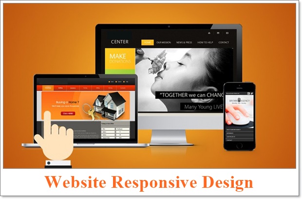
8. The majority of traffic coming in via mobile devices. A good web design agency Birmingham will provide a website responsive to screens of different sizes across all platforms.
9. A banner or a hero image grabs the visitors attention right away and overwhelm them to stay on the website longer and not swift away.
10. It’s the minimalism that matters. A website with limited content and graphics will shine brighter than a website trashed with non-essential stuff.
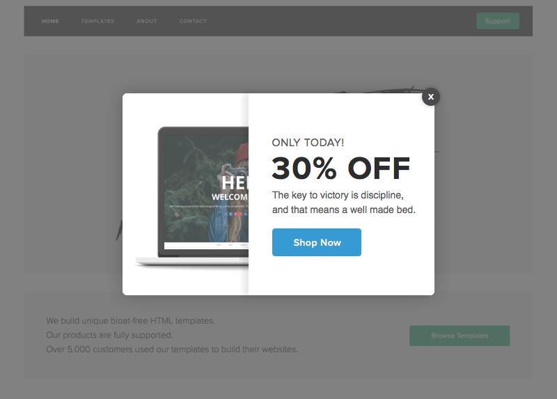
11. Okay. If you don’t want your visitors to bounce away to the competitor’s website, the number of pop-ups must not exceed more than 2. You certainly don’t want the customers UX hinders in any way.
12. Make sure there are no typography mistakes, grammatical and spelling errors, and spacing or alignment issues.
13. The SEO optimized website is a crucial part of increasing your organic traffic. A site with low loading speed will drop the users as well as Google’s interest in your website. It’s important to look for a professional hand that excels in SEO, PPC, and another marketing strategy to keep up with today’s competition.
Also read: Why Your Business Needs a Professional Website
14. The relevant and apt keywords prevailing in your website catches the goggles’ attention. It will pop your landing page or website link on its top searches.
15. Avoid cushioning everything on the homepage. It must highlight only your logo, tagline, USP and services offered.
16. Use SVG format due to its infinite scalability feature. It will keep your images pixel perfect. Ultimately, make your website responsive.
17. Use skeleton screens where requires to keep your visitors nagged with partial-loaded screen for a short span of time till the full-loaded screen.
18. Never use splash screens for desktop versions. They are used more for the mobile version of the website to make bold first impressions and reinforce brand identity. Although, they are majorly used for mobile games.
19. Never make a mistake of popping a subscription or registration form at the doorstep of the website.
20. If you plan to put a video or audio on your website, avoid Auto-play. The scripts are always running and eventually slow down the operating speed.
21. Your main content must be isolated or segregated from the advertisement.
22. It’s very common to see but avoid “coming soon” or “under construction” message totally if you wish to keep your website professional. This leaves a wrong impression on the customer.
23. Keep the website maintained and updated constantly. Avoid a 404 Error message, broken images or any technical appearance.
24. Before you make the website go up and live, test it thoroughly through all platforms, devices, and cross-browsers. Screen resolution testing is highly suggestible.
25. Your website must look natural. Avoid usage of stock photography as it gives an impression of “being fake”. You may produce your design layout with an amalgamation of custom and stock photography or authentic images.
User-Friendly Architectural Design

26. If you plan to post a large number of blogs and content daily, make sure your content looks organized. It is advised to use page hierarchy to make the content is easy to find.
27. The site’s navigation should be easy to scan for users. To get the keywords into the website, many webmasters insert all kinds of bizarre menu items. Use only relevant information for menus.
28. The mega menu button with sub-menus in a logical order. During the design and development phase, make sure the menus are responsive.
29. You can use a drop-down or vertical menu styles and one-page scrolls.
30. Use your header for branding; encapsulate it with the essence of your products or services.
31. To make the user experience of finding the website’s sections and pages easy, make use of breadcrumb navigation. They visually aid the user to reduce the number of clicks to get to a higher-level page.
32. Try to provide all your valuable information within the first fold of the website. 80% of the users tend to find website information within the first fold.
33. A good technique to make the users want to learn more about your website is to provide a glimpse that there is something below the first fold.
34. If your products/services are catered all around the globe, make sure you put a translator because consumers prefer to get engaged better when the information is in their language. Avoid machine translators.
35. A CAPTCHA is a great security tool. Indulge yourself in fun and trendy ways to put CAPTCHA like identify the pictures, an addition or drag and drop.
36. Let them know your location for looking at a genuine company. Put a sitemap on the footer and a search bar at the top.
37. Lets users resume what they were doing initially by keeping the option of opening an external link on the new window.
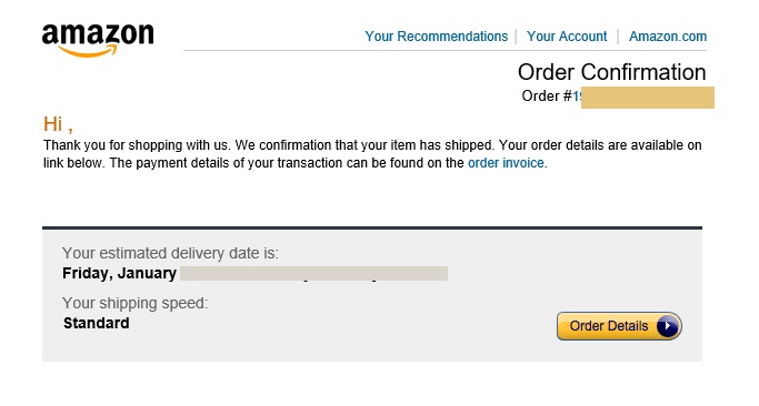
38. Provide a small acknowledgment message after any type of confirmation especially for an e-commerce website. Example. “Your product has been ordered successfully.”
If you want to know more about the best practices of e-commerce website design.
Also Read: Latest E-Commerce Website Design Features To Boost Online Sales
39. Don’t include every feature on your website in the name of “unique” Keep your brand consistent through the website. A color scheme, the same font, and layout pattern.
40. Your distinctive logo must direct the user to the homepage at all times.
41. Break the information of the website into pages. Reader prefers pagination over infinite scrolling.
42. The back button must be consistent and navigates back to the required page. This functionality must be consistent all across the website.
43. If your website updates the content frequently, for example, a news website. Don’t put a functionality of automatic refresh as it can hinder and irritate the visitor. Placing a small notification for new content is a better idea.
Create More Leads & Sales by Optimization
44. Offer more value or discounts when a user is leaving the website mid-way.
45. Choose your words wisely while creating your website CTA, like “View more”, “Click here”, “Buy now”. It can lead to better conversion rates as it seamlessly directs the user to take action, advantageous for your business.
46. Use attractive colors and test different shades for a call for action buttons to see what suits the best for your brand.
47. Include convincing content and persuasive media on your site.
48. The best practice is to put the main heading towards the top left corner. All the “call for action” towards the bottom right.
49. The customer doesn’t want to spend much time on the checkout process. Try to keep it as minimal as possible. Less number of steps and forms are a good way to make your customers revisit the website.
50. Stay convincing but don’t pester. If the user has left some vital conversion action mid-way, swiftly put a notification on the screen to remind them about it.
51. As a good way to boost your conversion, make use of small arrows as a directional cue.
52. Always try to follow up with a visitor who left a process in the middle.
53. Lure the customer with great deals and discounts when they are about to discard the cart.
54. Customers like to see mini-images of selected products when they put them in the cart.
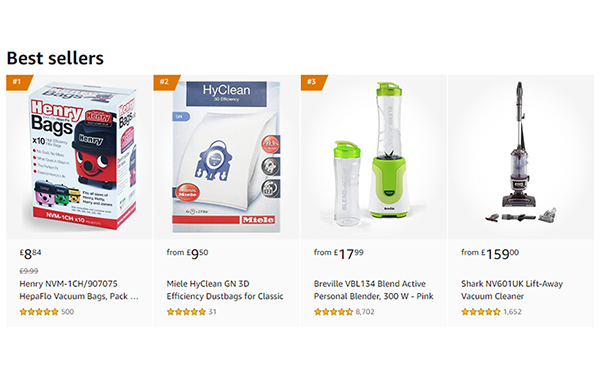
55. A column for features and best seller items on the homepage works brilliantly.
56. A single purpose landing page is more effective than a stuffed one. Keep it simple and straight. Avoid attaching outbound links.
57. Keep the registration process after the customer has put things in the cart. Keep the process hassle-free and quick.
58. Several factors go into careful determining of rates of the products. Don’t keep it overly expensive and plan out the structure.
59. Customers get curious when a discount is placed along with the original price tag. Keep the prices wherever necessary. It makes them feel anxious to see” only 1 left in stock” or “limited period only”
60. Keep it all-natural and provide the customer all that has been mentioned on the landing page. It builds trust and makes them revisit you.
61. Use authentic and good quality images on the product page.
62. At the last conversion funnel, keep away everything and anything mind-diverting.
63. Provide a section of recommended products or combo deals.
64. The visibility of your physical address, contact number, customer care number or tech support mail must be bold & clear.
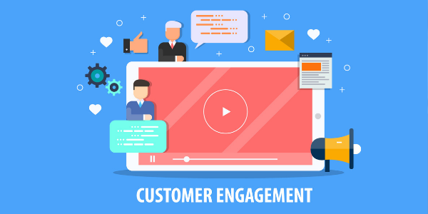
Customer Engagement
65. With all the concentration given to designs of the first fold of web pages, chances of content below the fold getting avoided are increased. Keep a symbol or a directional cue to keep the customer engaged.
66. A simple philosophy of giving free samples always works. Keep a “free trial pack” or “giveaway” or “1-month free” sort of plans so they start referring you to other people.
67. Keep the main menu limited to necessary menus and incorporate a drop-down or a nested menu bar.
68. Take the initiative to organize online events like webinars to discuss the current trends of your brand.
69. Make your products/services popular on social media platforms like facebook, twitter. Use the latest hashtags while posting blogs.
Also read: Which social network should I advertise on?
70. Stay consistent on posting blogs on the website and other platforms to increase user engagement.
71. Build your professional networking and contacts via the social media platform. There is no better way to establish a business networking relationship.
72. A newsletter integrated with MailChimp is an essential part of your website. It will update your members about your products, new launches, or any important event.
Keep the Website Interactive
73. The chatbots and artificial intelligence are kicking in but customers still prefer the old school customer care service or human interaction to get the issue resolved.
74. The customers want to know you before they make a deal. Keep your About us page crisp and detailed. Provide your mission, vision, and values so they know you better.
75. A brief description narrating the employees or the person behind the company’s work builds a sense of belongingness and trust with the customers.
76. A feedback or suggestion box post service/product delivery contributes to strong brand goodwill.
77. Use simple language to brief out how your service or products can help the customers out. Never make your website look crowded.
78. Make your digital presence warm, friendly and interactive so users feel connected to your brand and prefer you over your competitors.
79. Keep your review or comment section restricted and don’t allow the spam to bring you down with negativity.
Inculcate Trust Building Factors
80. Backlink your social networking links on your website. Stay active on them and reply to the user’s questions or concerns.
81. Show off your ethics and company culture to maintain transparency with the clients.
82. Take charge of the broken or damaged product. Provide a guarantee to garden the trust.
83. Emphasize on your national recognition, awards or accolades on your homepage.
84. Tell your story or a glimpse of behind the scenes. Bring your best clients, testimonials, and portfolio in the spotlight.
85. Add a section to highlight what third parties like influential bloggers; publishers have to say about you.
86. Your company policy including privacy policy, return policy, Terms, and conditions must be mentioned or popped up before the client seal the deal with you.
87. Always mention the reason if you’re requesting the user any specific detail.
Also Read: When to Consider a Website Redesign?
88. Elements like feedbacks, testimonials from your best clients contribute to increasing the trust and conversion rate tremendously. Put them right before CTAs.
89. Ensure that you display icons of the security features you’ve used on the checkout page.
Original Content and Relevance
90. Have a separate web page dedicated to resolving customers’ queries, FAQs and complaints.
91. Update your website from time to time to avoid it to decay and perish. Keep it fresh and maintained at all times.
92. Google will consider you on its list of the favorite website only if the content on your website is original, relevant and plagiarism free.
93. Use self-drawn graphics to generate originality and uniqueness.
94. A good way to grab users’ attention is to add statistics to support your content. For example, a web development agency will have its stats on the number of clients and years of experience on its website.
95. Use the same alignment and fonts all across the website to visually aid the visitor’s eye.
96. Hire a good content writer who adds the fun factor in the content of your website and keeps the visitor engrossed.
97. For an e-commerce website, the web pages ought to have proper segments.
98. Flatter your USP and things that make you an outstanding company. This will ease out the visitor to choose you over other competitors of the market.
99. Lay down the solutions in an interesting way and make your visitors hit the “contact us” menu. It will make your visitor think that you’re the right fit for them.
100. Your website must speak out loud the information crucial for visitors to know about your brand.
101. A crisp and clear break down of different subscription models. Suggesting which package offers what. Also, point out a recommended package.
We guarantee you feel more than aware of website selling tactics after reading this article. You’re sure answerable to the magical question “Ways to sell your website”
This article was to enlighten you with the dos and don’ts of a website selling ideas. But you must consider hiring a good digital marketing agency UK. that has a professional insight and knowledge of industry best practices.
If you want to stay updated on professional insights and industry best practices, it would be helpful if you subscribe to the following: Conversion-Rate-Experts, ConversionXL, Marketo, Moz & Bytegrow IT Solutions Their blogs are a great resource to learn more about conversion optimization and digital marketing strategies. Ultimately, it will save a lot of your time researching.
Also Read: Online Marketing Agency An Effective Way To Promote Your Brand
Feel free to write us down any feedback or query you have in mind about the article or accomplishing conversion rates.
Bytegrow IT Solutions can make inclusions & A Lot more.
Contact us